KRUMP BATTLE
Krump battles thrive on community energy and social media hype, but many events lack a clear online hub. This concept landing page explores how a focused website could reflect the raw spirit of krump while making it easy for visitors to understand the event and purchase tickets. The goal: high-impact, culturally authentic, and user-friendly.
HIGH-ENERGY EVENT WEBSITE CONCEPT
From social media posts to a clear event hub
Project Scope
- 2-day concept sprint
- WordPress, Pinterest
- Independent dance battle organizers
- The Master Key Rebuild
- Brand Refresh
- Website Design
THE CHALLENGE·
THE CHALLENGE·
THE CHALLENGE·
THE CHALLENGE·
THE CHALLENGE·
Translating raw street energy into a digital experience
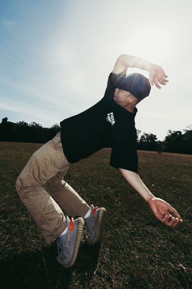
Krump culture is intense, expressive, and deeply rooted in community. Battles are high-energy community events, but their promotion often relies mostly on social media posts.
However, many events struggle with:
- scattered information across social media
- unclear schedules showcase
- difficulty finding ticket links
- visuals that fail to capture the intensity of battles
The challenge was to design a site that captures energy, clarity, and community making the event accessible while staying true to Krump culture.
RESEARCH & INSIGHTS·
RESEARCH & INSIGHTS·
RESEARCH & INSIGHTS·
RESEARCH & INSIGHTS·
RESEARCH & INSIGHTS·
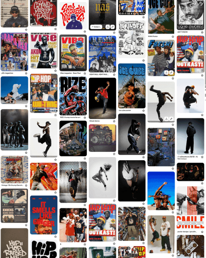
Understanding the visual language of krump culture
Krump originated in early 2000s Los Angeles, as an expressive form of street dance known for its powerful style rooted in emotional release, community thus leading to crime prevention. To translate this spirit visually, I explored references related to:
- street culture and art
- graffiti aesthetics
- high-contrast urban photography
- battle energy, culture and competition posters
- bold typography and dramatic compositions
Key visual themes emerged:
- dark, stage-like backgrounds to create intensity
- bright red accents symbolizing energy, intensity and movement
- bold typography reflecting street culture
THE STRATEGY·
THE STRATEGY·
THE STRATEGY·
THE STRATEGY·
THE STRATEGY·
Energy, clarity, and community
The design direction focuses on three priorities:
Energy — Capturing the spirit of the battle
A bold visual style reflecting the explosive, raw and emotional nature of krump.
Clarity — Making the event easy to understand
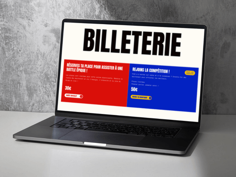
Visitors should immediately find the program, location, and ticket information.
Community — Highlighting the community
Sections dedicated to dancers, judges, and battle categories reinforce the collective nature of the event.
Keywords guiding the design:
Raw | Expressive | Urban | Energetic | Community-driven
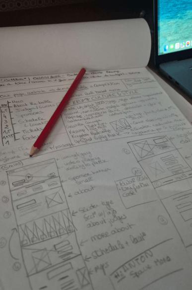
THE PROCESS·
THE PROCESS·
THE PROCESS·
THE PROCESS·
THE PROCESS·
Designing a focused event landing page
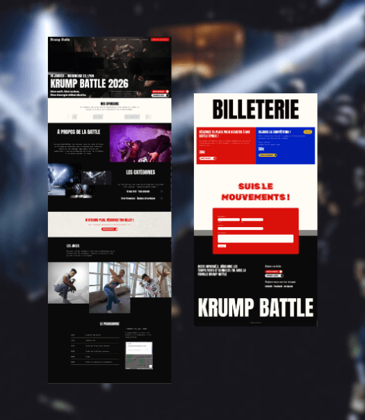
The website structure follows a single-page format designed for fast navigation, especially from mobile devices. This structure ensures visitors can quickly understand the event and decide to attend.
- Hero section communicates the event instantly
- Bold headings guide scanning
- Clear call-to-action buttons for ticket purchase
- Mobile-friendly layout optimized for social media traffic
Each choice balances cultural authenticity with usability.
Visual Identity
Color Palette
To capture the raw energy of krump culture while keeping the interface readable, the palette balances bold accents with neutral backgrounds. Key colors like red convey intensity, while dark and light neutrals provide contrast without straining the eye. Accent colors like yellow and blue add vibrancy and movement.
Typography
Headlines use Anton for strong, poster-like impact, while body text remains readable with Space Mono. Occasional decorative use of UnifrakturCook references graffiti and street culture.
Design Direction
The design balances raw street energy, visual impact, and clarity, creating an expressive yet structured experience for an event website.
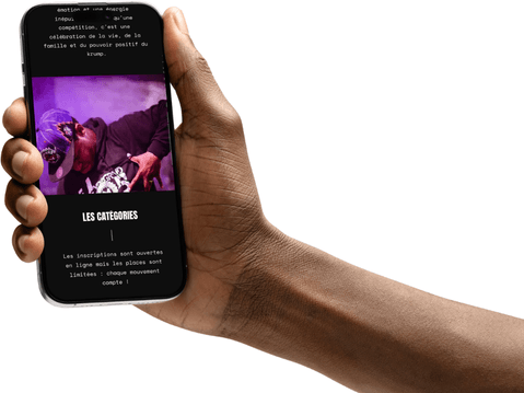
THE OUTCOME·
THE OUTCOME·
THE OUTCOME·
THE OUTCOME·
THE OUTCOME·
The result is a high-energy, usable digital experience aligned with the community-driven spirit of krump. The landing page:
”“Wow, what you did is amazing!”
Received through text


Learnings & Takeaways
- Designing within cultural context is crucial for authenticity
- Bold visuals can coexist with clarity and usability
- Concept could expand to include online registration, integrated ticketing, media galleries, and social media integration