
VEJA is a French sustainable sneaker brand known for its strong ethical values, eco-friendly materials, and zero advertising policy. However, their existing e-commerce website wasn’t fully aligned with their mission: the UX was confusing, the UI was harsh, and the digital carbon footprint was surprisingly high.
VEJA
This redesign explores how VEJA could create a modern, fluid, and responsible e-commerce experience that better reflects their sustainable ethos.
ABOUT THE PROJECT
VEJA - A sneaker creator that respects people, the planet, and craftsmanship (Concept project)
Scope
- The Master Key Rebuild
- Visual Identity Refresh
- Website Redesign
THE CHALLENGE·
THE CHALLENGE·
THE CHALLENGE·
THE CHALLENGE·
THE CHALLENGE·
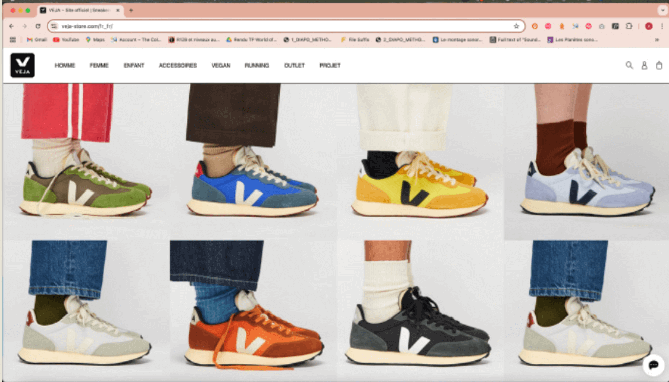
Although VEJA leads in sustainability in the physical world, its digital presence didn’t reflect these values:
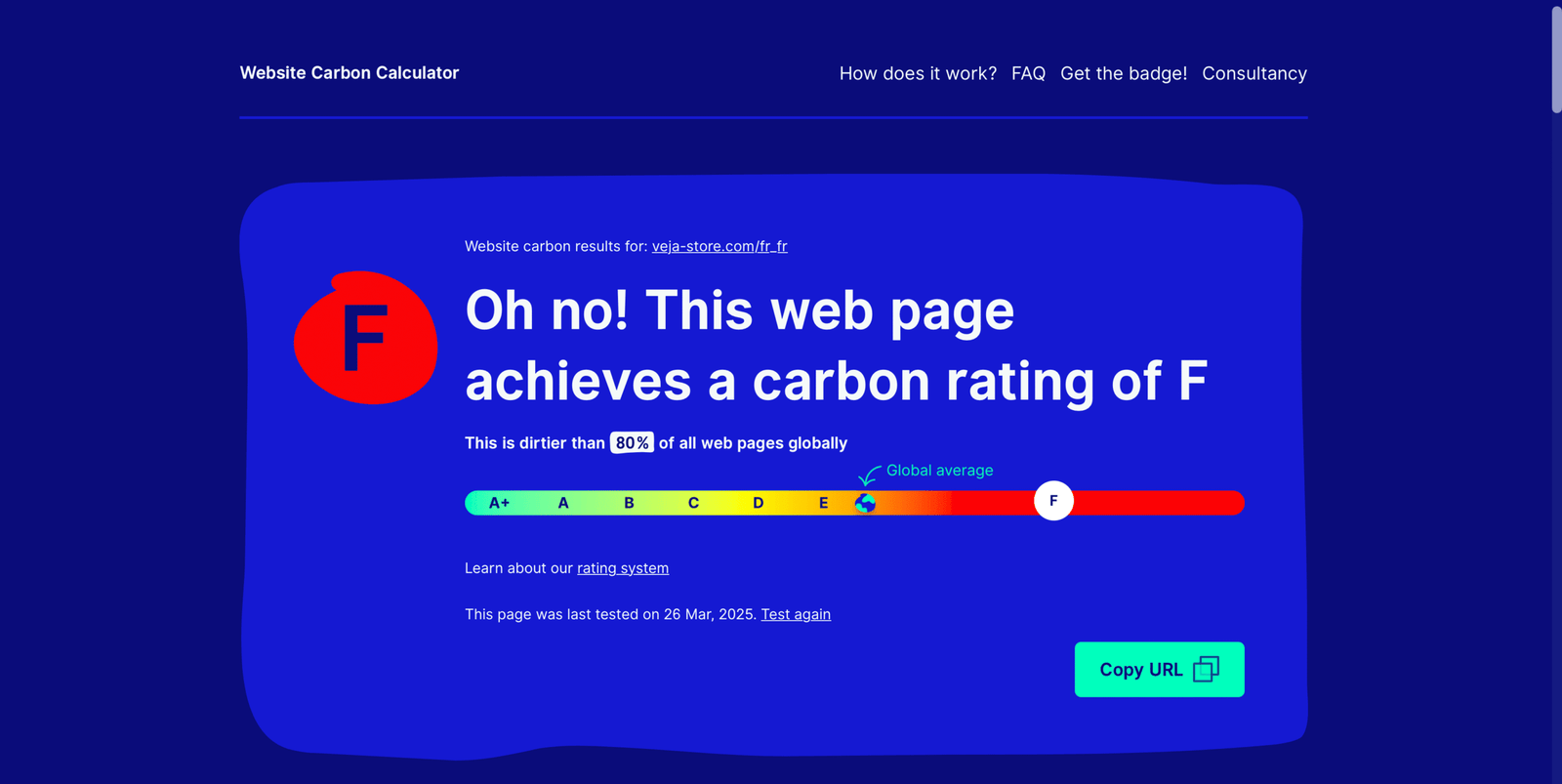
- High carbon footprint compared to similar websites
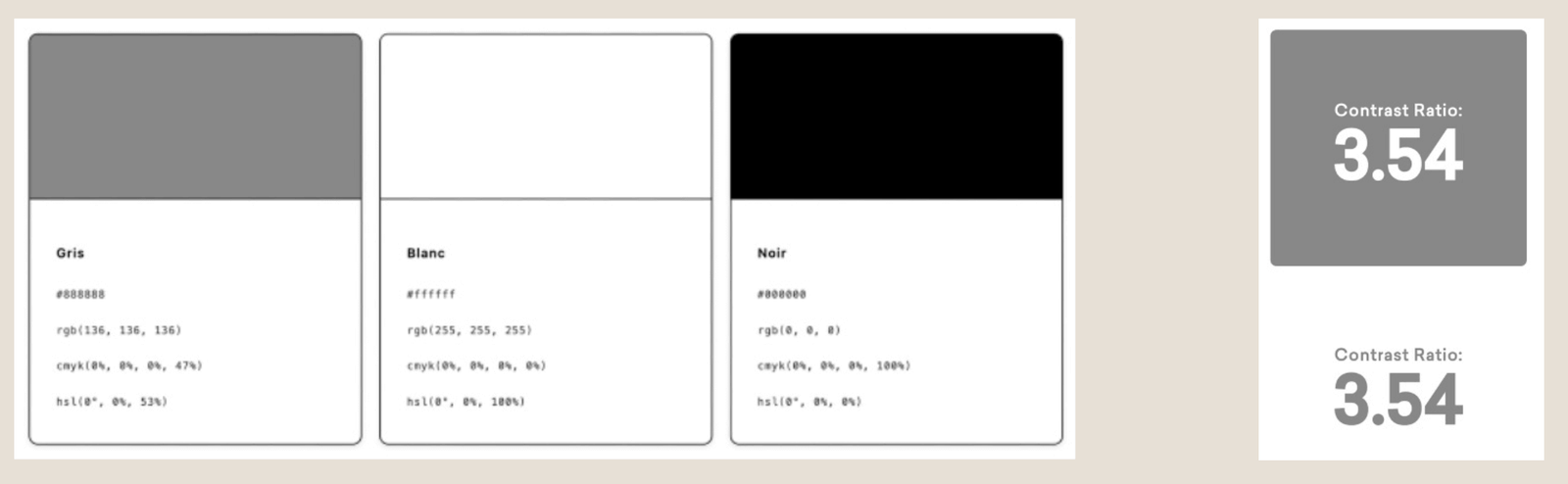
- Heavy use of pure black & white, causing eye strain and high energy use.
- Confusing navigation — key categories like “Vegan” or “Outlet” weren’t visible in the menu.
- Product pages felt cramped and unclear.
- Newsletter section was almost invisible and not GDPR-compliant
- No headers on key pages, poor hierarchy, and missed opportunities for engagement
A brand that’s built on clarity and responsibility offline needs the same online — both visually and experientially.
RESEARCH & INSIGHTS·
RESEARCH & INSIGHTS·
RESEARCH & INSIGHTS·
RESEARCH & INSIGHTS·
RESEARCH & INSIGHTS·

I analyzed the existing site and competitor experiences, then focused on 3 pillars:
Eco-Responsibility in Digital
- Website Carbon, Green Web Foundation & EcoIndex reports showed the site was more polluting than average.
- Switching from pure white to softer tones and optimizing media were key.
Visual Alignment with Brand Values
- Current palette felt sterile. VEJA’s mission needed to be reflected in a softer, warmer, and more human interface.
User Journey Optimization
- Simplifying navigation, improving visibility of categories, clarifying product pages, and emphasizing repair/vegan sections were critical.
THE STRATEGY·
THE STRATEGY·
THE STRATEGY·
THE STRATEGY·
THE STRATEGY·
Goal: Align VEJA’s digital presence with its sustainable ethos and deliver a seamless, modern shopping experience.
- Develop a new design system inspired by VEJA’s materials (cotton, leather, rubber).
- Reduce digital energy use through color palette, asset optimization, code minification.
- Rework information architecture for a more intuitive flow.
- Create a consistent visual language across pages.
- Make key ethical categories more discoverable.

THE PROCESS·
THE PROCESS·
THE PROCESS·
THE PROCESS·
THE PROCESS·
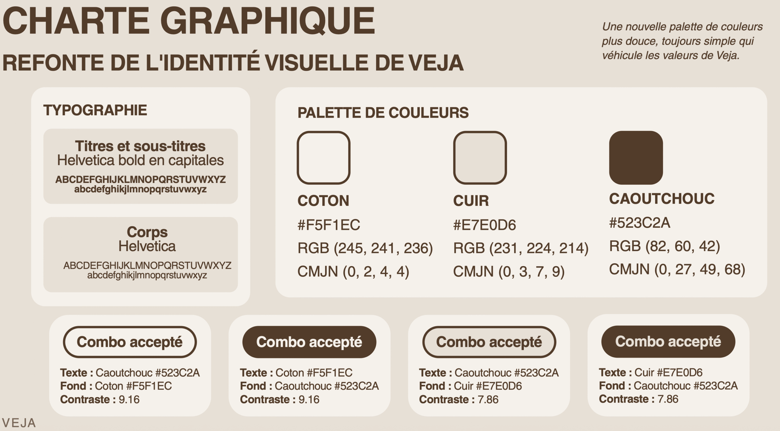
- New palette using Cotton (#F5F1EC), Cuir (#E7E0D6), and Caoutchouc (#523C2A) for softness and energy efficiency.
- Typography kept Helvetica for brand recognition but optimized hierarchy.
- Accessibility contrast checked for all combos (minimum 7.86 contrast ratio).
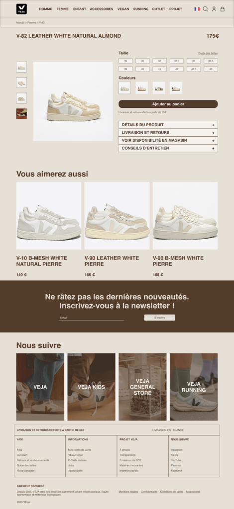
- Sitemap & wireframes created in Figma.
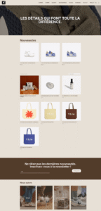
- Reworked homepage structure to highlight key categories (Vegan, Outlet, Projects).
- Added headers to all pages for clearer context.
- Optimized imagery (WebP, compressed assets).
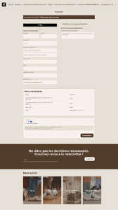
- Clearer product pages and improved newsletter signup flow.
THE OUTCOME·
THE OUTCOME·
THE OUTCOME·
THE OUTCOME·
THE OUTCOME·
Sneakers that respect the planet deserve a digital experience that does the same.
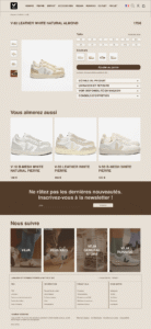
- A fully redesigned e-commerce experience that reflects VEJA’s sustainable mission online.
- Softer, energy-efficient UI aligned with eco-responsible values.
- More intuitive navigation, making ethical categories easy to find.
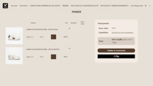
- Clearer product pages improving readability and purchase flow.
- Optimized performance through image compression, code minification, conscious plugin usage and better color usage.
- Improved newsletter signup clarity and GDPR compliance.